
Mobile-First Website Design: Why Your Kenyan Customers Judge You on Their Phone
Thumb-friendly navigation, fast loading on mobile data, click-to-call and WhatsApp buttons — the mobile design principles that turn visitors into customers.
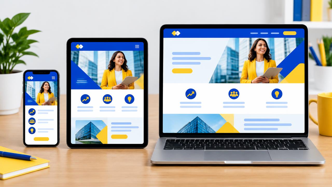
For most Kenyans, the phone is the main — often the only — way of getting online. The Communications Authority of Kenya's sector statistics consistently show mobile subscriptions and mobile data far outpacing fixed connections. If your website is designed on a big monitor and "squeezed" onto a phone afterwards, you are designing for the minority.
What "mobile-first" really means
Mobile-first means designing the smallest screen first, deciding what truly matters, and then adding layout and detail for larger screens. It forces clarity: one main message, one main action, no clutter.
It also matches how search engines work. Google uses mobile-first indexing, meaning the mobile version of your site is what gets evaluated for rankings.
Eight principles that make a difference
- Fast on mobile data. Compress images, use modern formats such as WebP, and avoid heavy sliders. Every extra megabyte costs your visitor money and patience.
- Thumb-friendly buttons. Make tap targets at least 44–48 pixels high with enough space between them.
- Click-to-call and WhatsApp. A visible "Call" or "Chat on WhatsApp" button often converts better than a long form.
- Short forms. Ask only for what you need. Use the right keyboard type for phone numbers and email.
- Readable text. At least 16px body text, good contrast and short paragraphs.
- Simple navigation. A clear menu with your main services, and a search box for larger sites.
- Mobile payments. For shops, M-PESA STK Push lets customers pay without leaving the page — see how STK Push works.
- No intrusive pop-ups. Full-screen pop-ups on mobile frustrate users and can hurt search visibility.
Measure what matters: Core Web Vitals
Google's Core Web Vitals measure real-user experience:
- LCP (Largest Contentful Paint) — main content should appear within 2.5 seconds.
- INP (Interaction to Next Paint) — the page should respond to taps within 200 milliseconds.
- CLS (Cumulative Layout Shift) — the layout should not jump around (score under 0.1).
Good hosting matters here: a fast server with caching, such as our WordPress hosting on LiteSpeed, gives your design a head start. Our WordPress speed guide goes deeper.
Quick self-test
Open your website on an average Android phone, on mobile data, outside the office Wi-Fi. Can you find your phone number in three seconds? Can you request a quote with one thumb? Does the page load before you lose interest? If not, it is time for a website redesign.
Build it right from day one
Every site we build is designed for phones first and tested on real devices. See examples in our portfolio or start with a corporate website or online shop.
Share this article
Was this article helpful?
Your vote helps us write better guides.